Evolving with a brand
A journey as brand custodians of
The brand has evolved alongside the place, but vibrant colour and creating a distinctive experience has always been at its heart.
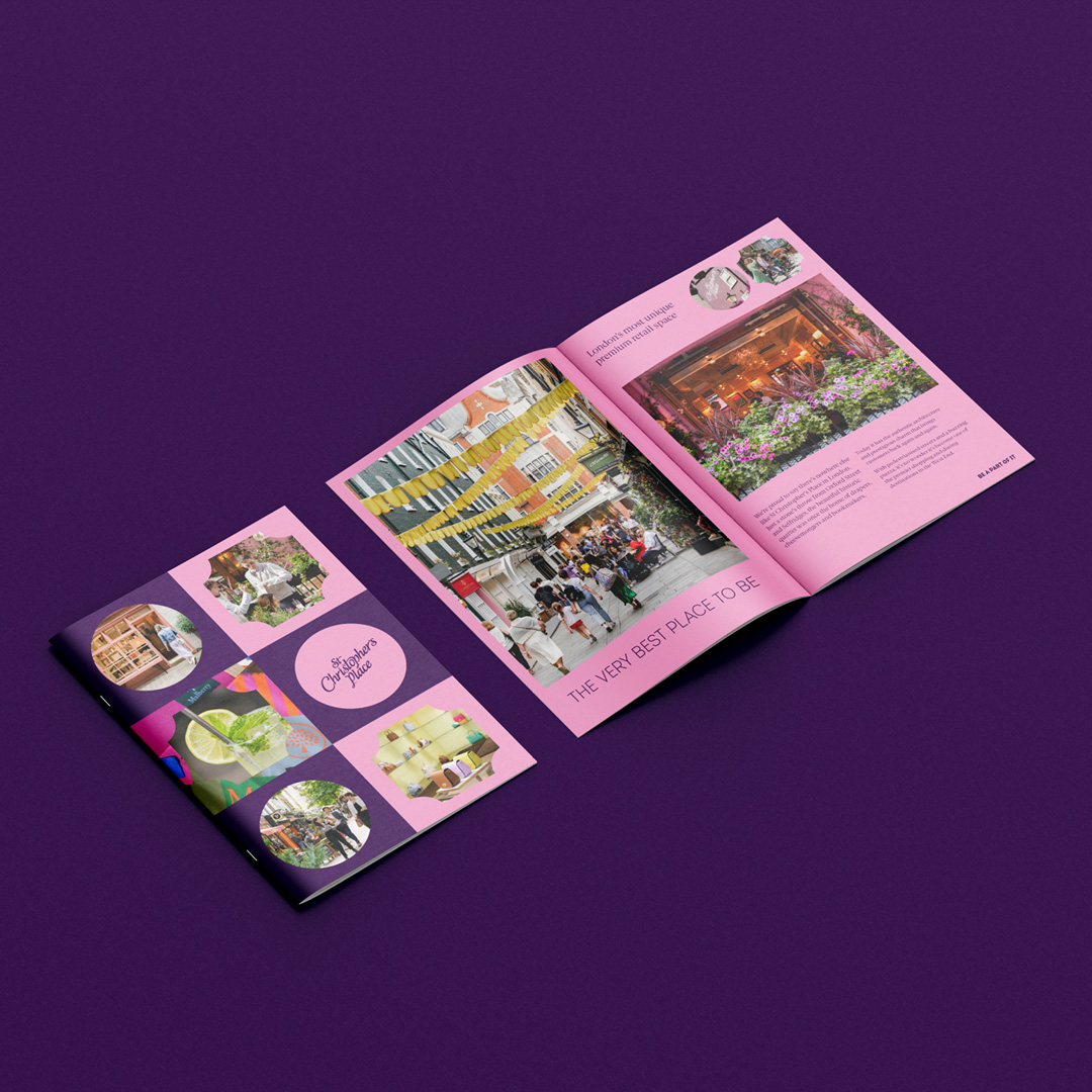
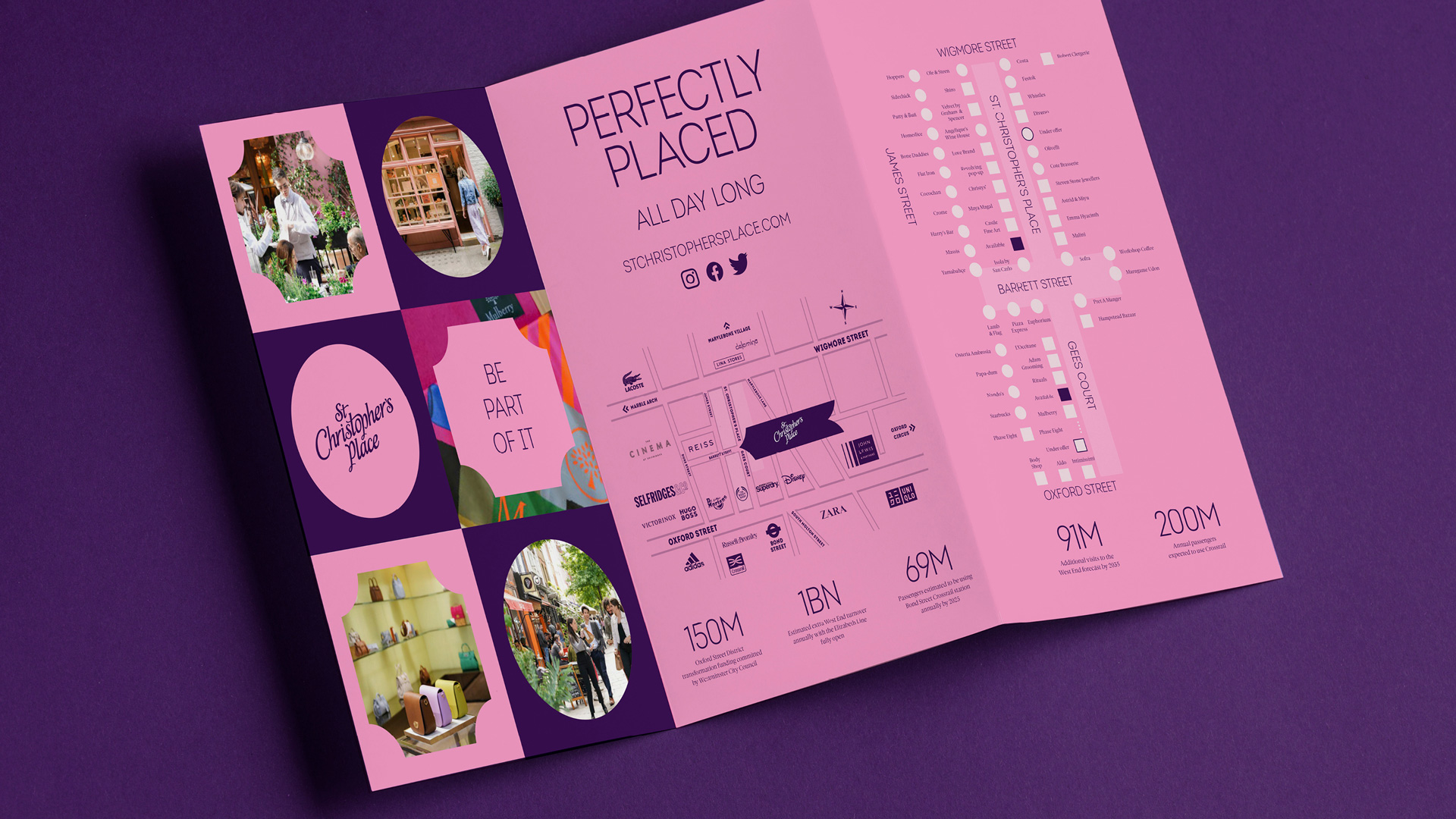
St Christopher’s Place is at the heart of the bustling West End, yet retains a distinctive ‘hidden gem’ charm with its historic piazza and colourful streets. Must-have brands nestle alongside must-try restaurants.
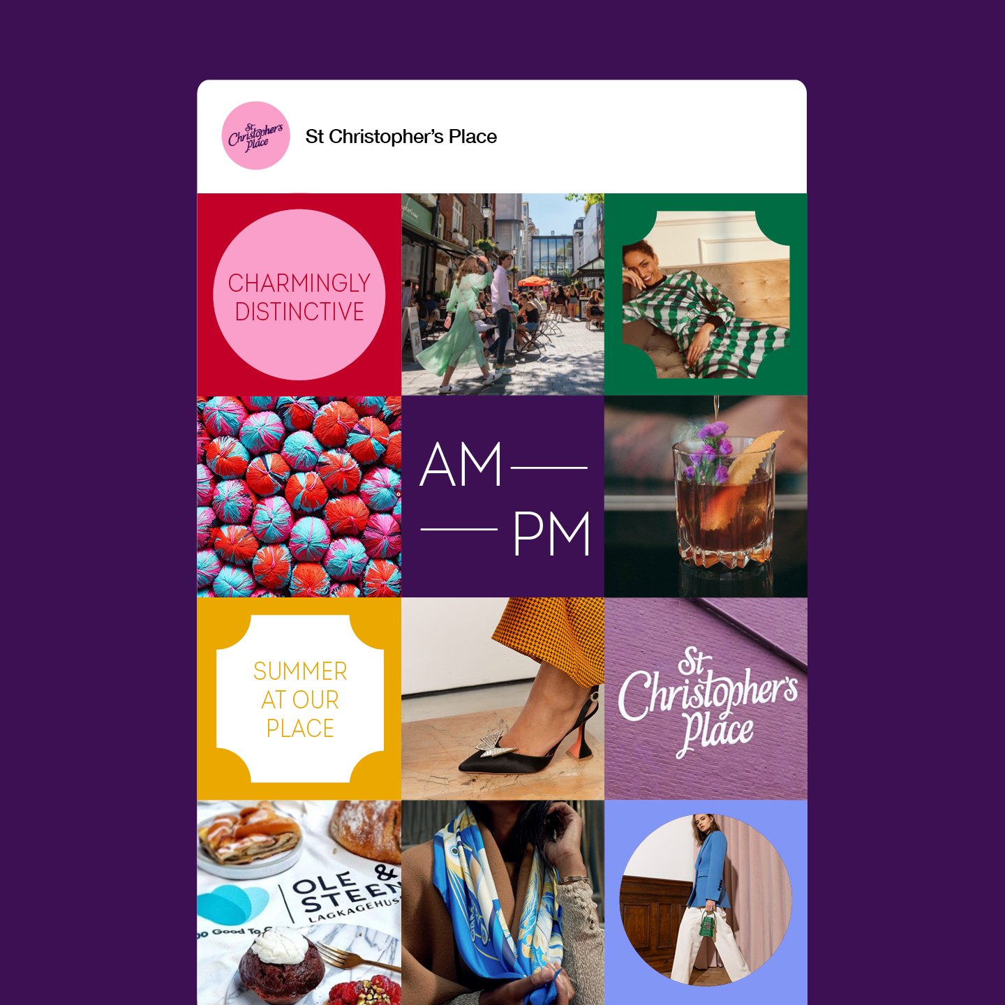
Charmingly distinctive
Our role was to create a brand strategy and visual identity that would connect with their diverse audience of locals and visitors. Positioning their food and retail offer as a different kind of experience, defined by their unique setting.
For the latest brand evolution we looked to St Christopher’s Place most iconic feature for shapes unique to them. We created our pattern by combining the clock face and circle shapes. Curating a bright and rich colour palette, paired with an elevated and emotive approach to photography.

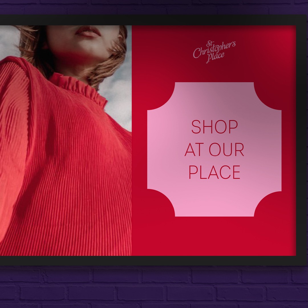
We lead with experience
Painting the town purple and pink.
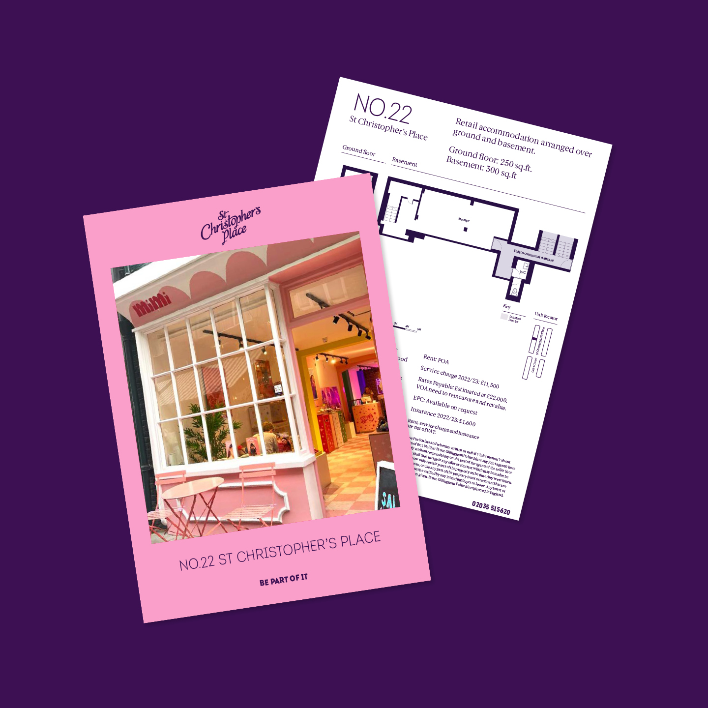
By defining boundaries within the environment, we created distinction so our audience know when they’re entering St Christopher’s Place.
We invite and welcome, showcasing the tenants and their offers.
The result is an immediate brand presence, creating a joined up and memorable experience that is personal, celebratory and impactful - whatever the touch point.
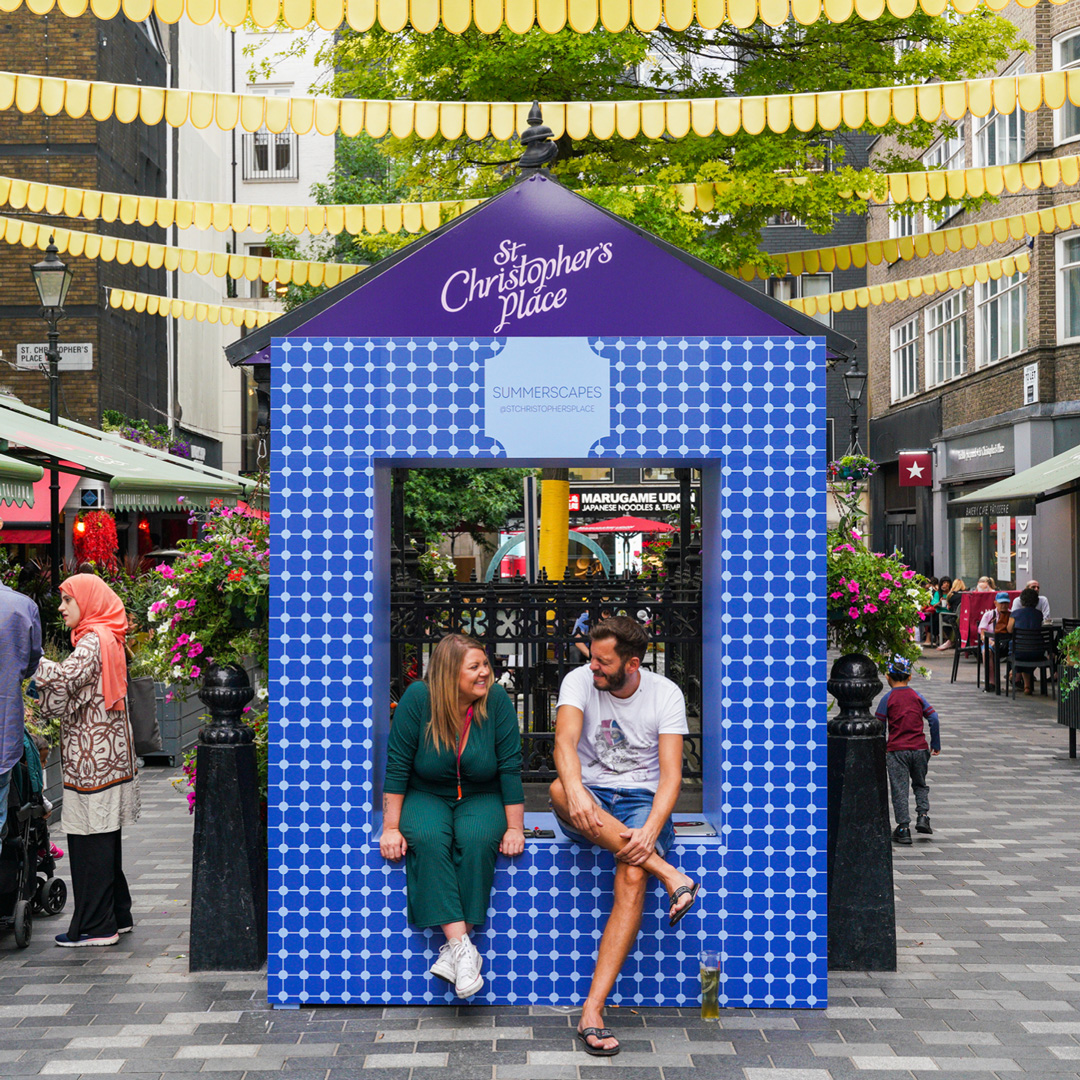
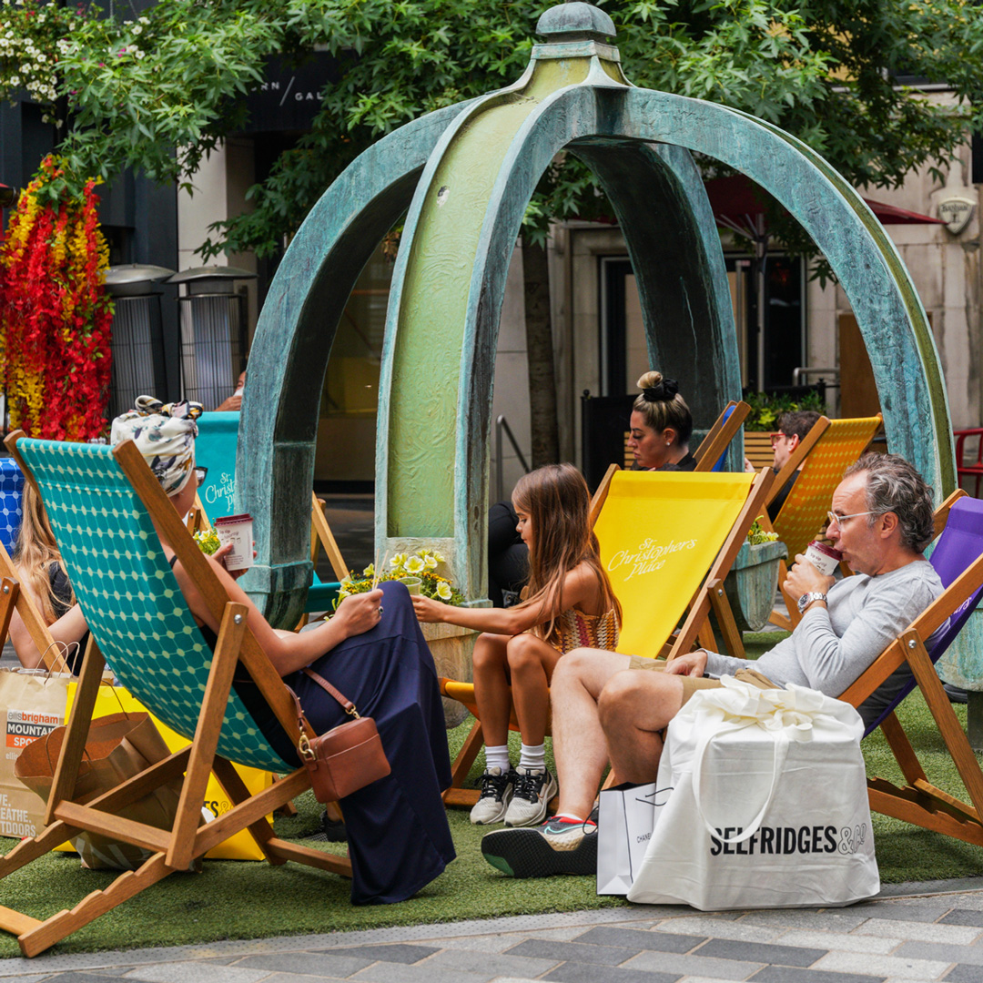
Always in season
From day to night, summer to winter. As an experience-led brand keeping things fresh and generating a new buzz (and selfie opportunities!) is all important.
The result is an identity with a united voice, that connects St Christopher’s Place tenants through a single approach, celebrating the vast and exciting choice of F&B and retail.